
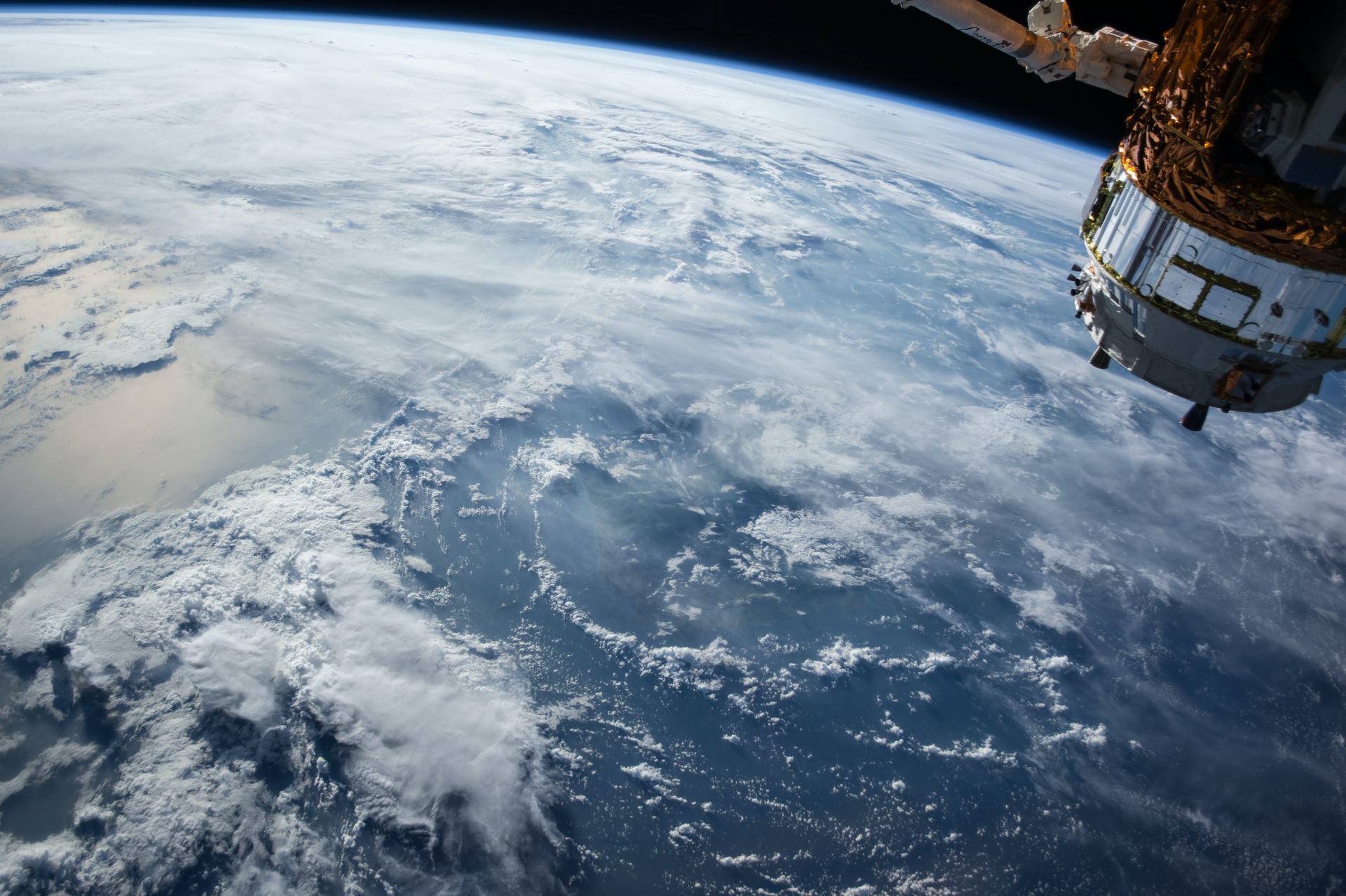

How to make good even better? Make it more visible to human eyes.
Our original satellite layer offered (as a default) images from the visible spectrum, which means we presented the data "as is" straight from the satellite camera. This gave us the full detail. But for most of us, it was hard to distinguish countries, seas, oceans, and lakes. We have left "Visibility" as an option, but we have added the "Blue" spectrum that uses a false-color range as a default.

From our point of view, the changes are magnificent. It enables us to understand weather patterns to an even broader audience.
This feature was brought to you by our whole Windy team. But being honest, most of the work was done by Milan, our WebGL guy. So kudos to him.

https://www.windy.com/-Satellite-satellite?satellite,51.865,24.046,4,internal
 Jari Sochorová


 Nicole Dolezalova





Comments (19)
With such a quality the widget is not really useful.
Here shown from BLUE widget and layer on iPad.